

Testing testing – matchy matchy
Only a minor rant here, but here's why I think case-sensitive comparison checks are just plain annoying!
26th August 2022 / by Richard Gray
I must be going soft in my old age, for I’ve not found anything really worth ranting about recently. I did, however, come across something I really liked which is worth mentioning here.
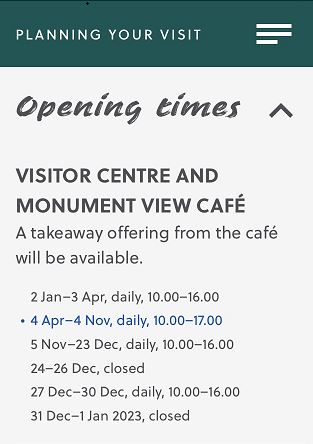
The image above shows a list of opening times for a visitor centre. What I really liked was the way that the current period was highlighted, meaning you didn’t need to work your way through the list to find the option which applied.
Yes, we all know what day/month it is, and yes we could work it out easily enough but this is just another example of the “don’t make me think” methodology we need to apply to our websites.
I knew straight away which opening times applied based on the highlighted entry – it was quick and I didn’t need to think about it. And it would be very easy to do this programmatically so that you don’t need to keep editing your web page when the month/period changes.
Hurrah.
If you think we can help with your next project, please drop us a line or call us. We’d love to meet with you to see how we could work together.
Our offices in Stratton St Margaret are easy to reach with free parking right outside the door.
Telephone:
Alternatively, drop us an email @ Pink Fish